As a part of one of my core classes at Georgia Tech, 'Research Methods for HCI', students were divided into teams of 5 and tasked to work with an industry sponsor on a given problem statement and formulate an evidence-based design solution.
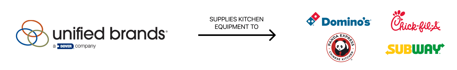
My group chose to work with Unified Brands, a multi-national conglomerate under Dover – which produces commercial kitchen equipment, the same kind of you see in the Chick-Fil-A's, Domino's, and McDonald's of the world.
Problem
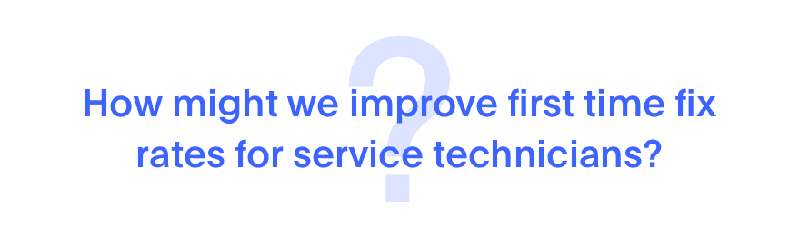
Unified Brands came to us in hopes to understand how they could help service technicians improve first time fixes – a measure defined by them as the turn around time taken to fix a broken piece of restaurant equipment in less than 2 days.
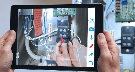
Their R&D team had already started to look into this prior to our associated with them, and was evaluating Augmented Reality solutions to remotely assist technicians for faster fixes.
Solution
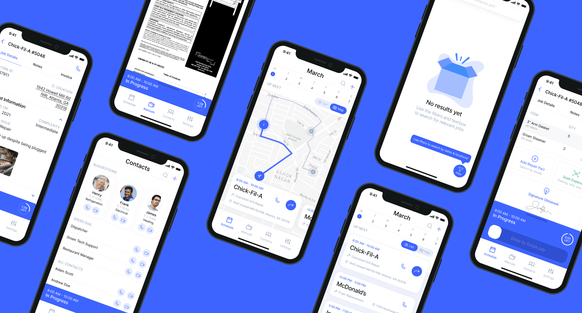
Daily schedule at a glance.
- Allows technicians to look at their daily schedule and visualize their map routes
- Search and filter work orders by company, location, and repair types
- Create new work orders on the go in case additional repairs are needed
On The Job Companion.
- Supports technicians through time keeping & image annotations
- Invoice management including ability to add items, scan additional expenses, and obtain signatures
- Micro-interactions that facilitate a delightful job completion experience
Manuals & Contacts
- Access service manuals sorted by manufacturer
- Get advice from experienced technicians in particular fields
- Control display settings such as text sizing for increased accessibility
Our Approach

Research

We decided to divide our research into two phases – a primary research phase where we understood the context of the problem, conducted initial stakeholders interviews, the service repair lifecycle, and audited existing solutions.
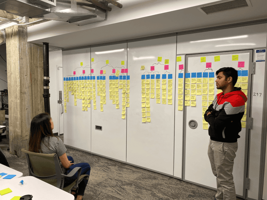
This was followed by a secondary research phase where we conducted 3 in-depth contextual inquiries, 6 user interviews, and then synthesized all of this data into an affinity map that helped us build personas, empathy maps, journey maps, and design ideas.
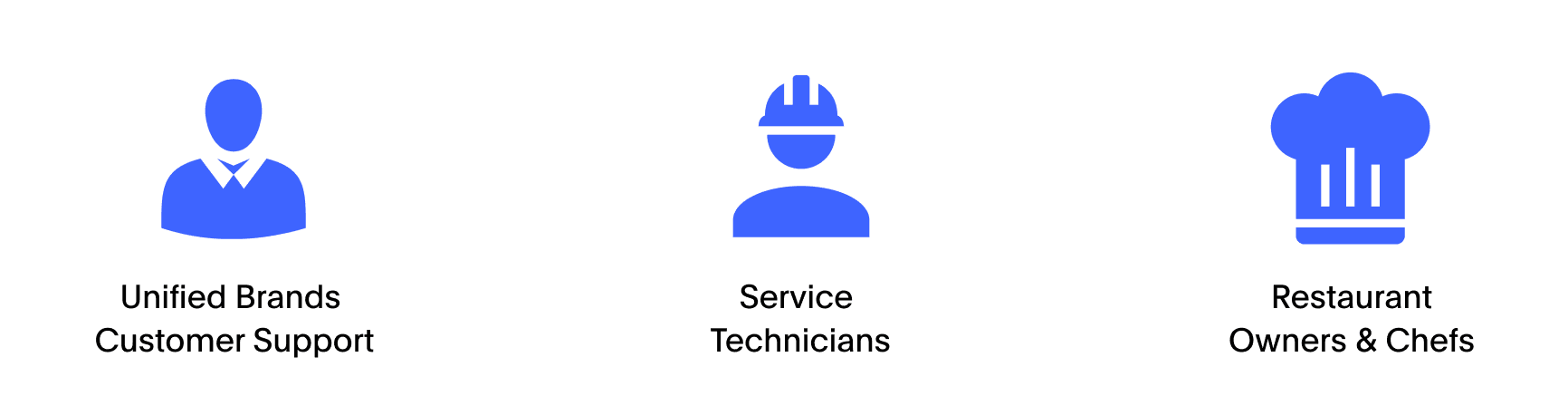
We identified our stakeholders, conducted formative interviews, mapped out the service repair cycle, and took a look at some of the important tech-based solutions currently present in their workflow.
Understanding existing AR solutions
We analyzed the problem space and how state of the art Augmented Reality solutions help technicians make the repair lifecycle faster.
Understanding the equipment
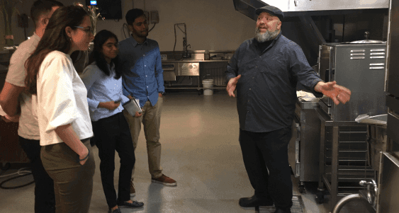
We visited the Dover HQ to understand the manufacturing and repair process behind the commercial food equipment we were used to seeing from the consumer's perspective.
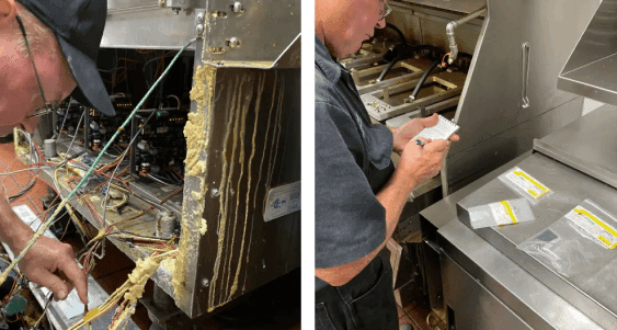
Real world immersion
To truly understand the technician's day to day work, we went on ride alongs on actual service repairs in order to analyze what tools they use, the enviroments they're in, and how they fix issues.
Analysis
We synthesized the collected data from the interviews and contextual inquiries into an affinity map to help form insights and brainstorm design ideas to solve higher order problems.
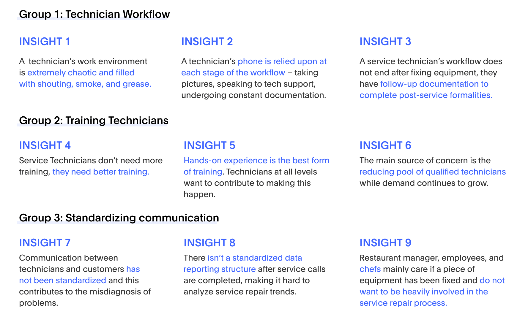
Insights
Based on the affinity map, we generated the following insights by grouping similar notes under similar headings.
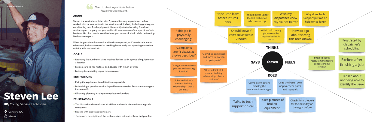
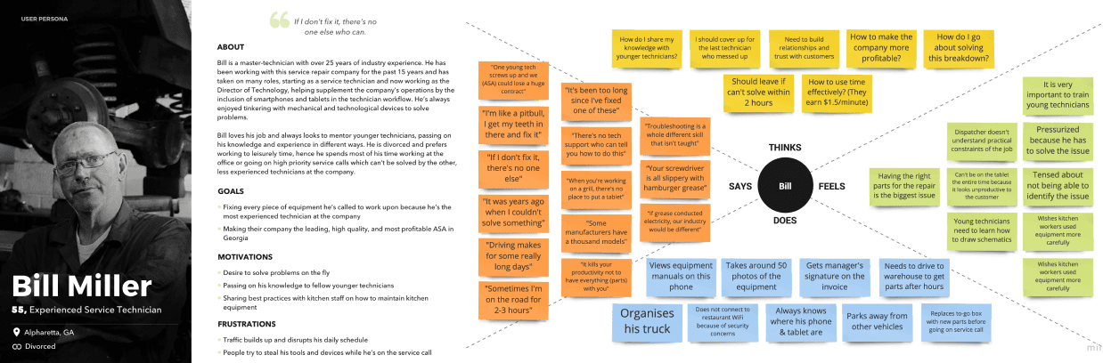
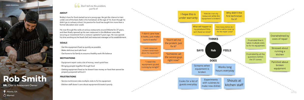
Personas & Empathy Maps
Based on our insights and observations from the research methods, we created three personas that captured the essence of our users and their characteristics. We also formed empathy maps to understand their needs and frustrations.
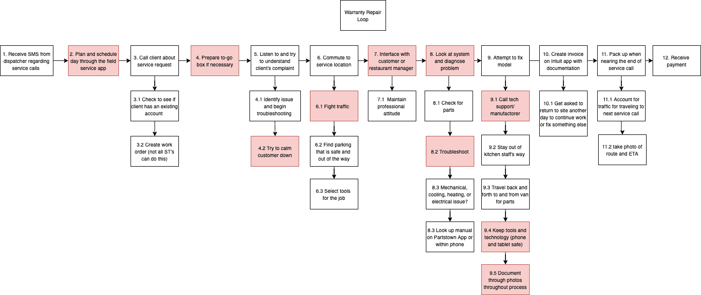
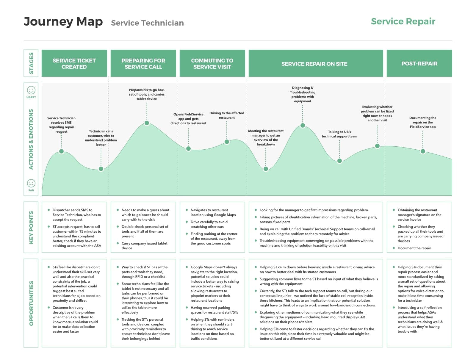
Task Analysis & Journey Maps
The personas and empathy maps helped us outline an hierarchical task analysis, which we then used to make a journey map highlighting the pain points and the opportunities for improvement.
Design
Given our research findings, we came up with three divergent design ideas that tackled the problem space. These spanned from fixing the service technician's workflow, improving client-technician communication to a training platform for mentoring young techs.
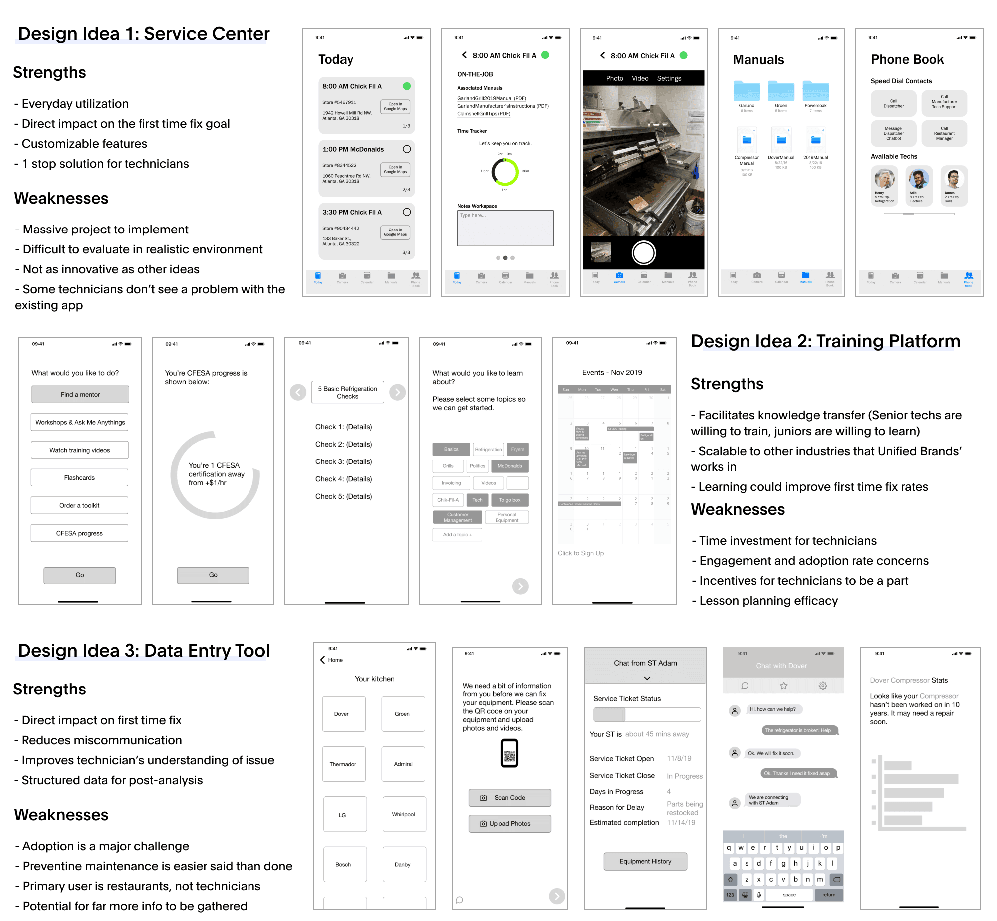
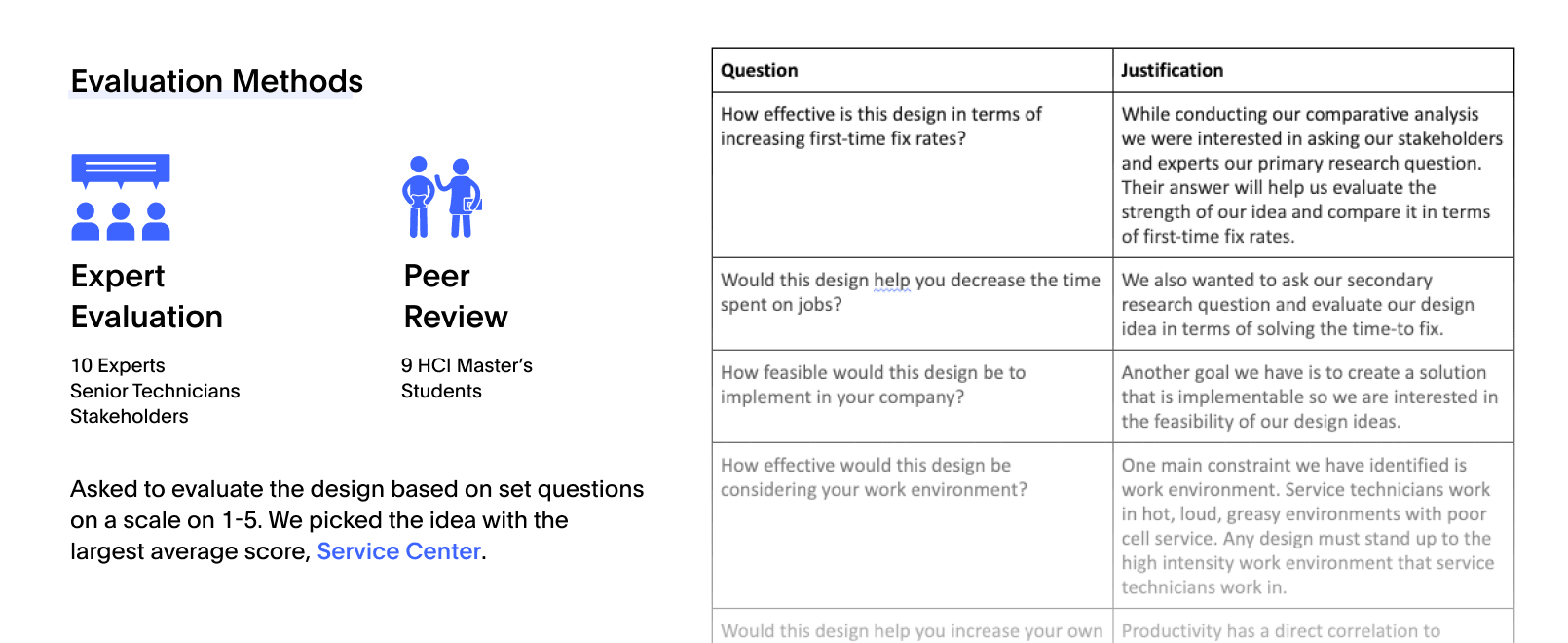
We conducted expert evaluation and peer review sessions to evaluate our three designs. A set of standard questions were asked to evaluate interest in the designs. We ended up choosing the design with the highest scores – Service Center.
Iterative Design
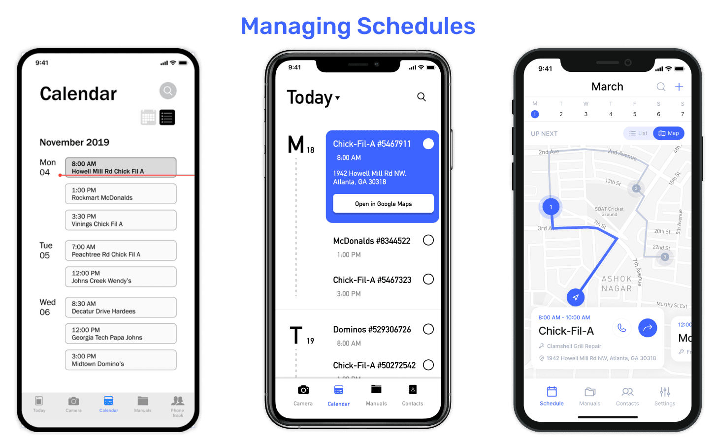
The first iteration of the Schedules section had two tabs – Today and Calendar. Even though it allowed users to choose between various views (daily, weekly, monthly), we thought that 5 tabs in the bottom navigation would make it feel cluttered on smaller device sizes. Hence, in the second iteration, we grouped these two into a 'Schedule' tab. When we presented this to technicians, they told us that their schedules change often, and that we should only focus on the daily view.
Some of the other things they mentioned where: 1) the Search functionality should let them search past jobs by location, dates, and repair types. 2) They wanted to be able to visualize their route on a map and see the different waypoints for the day. The final and third iteration helps them switch between List & Map views, while allowing them to add filters to their searches.

While technicians are on the job, we wanted to enable them to keep their time on track, while supporting their common tasks. Between the first and second iterations, we mostly focused on IA & Visual Design, but after presenting the second iteration to technicians, we realized that these tasks could be grouped into different tabs for easier access. Hence, the third iteration focused on 3 nested tabs, and a sticky bottom sheet that helped them keep track of time while acting as the confirmation step for ending a job. Technicians also requested features such as camera annotations and better signature flows for restaurant managers, all of which we included in the third iteration.
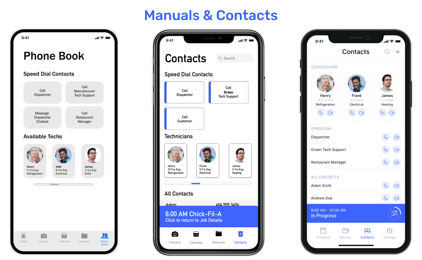
Technicians often mentioned the need to be able to look up manuals and contact relevant folks when they needed help. This is why our solution has tabs for these two use cases inside the app itself. The manuals can be filtered or sorted by company, part type, et cetera. The contacts list is dynamically updated based on the job they are performing. For example: If they are replacing a grill at McDonalds, their suggestions will include fellow technicians from the same company who have worked on similar repairs recently, along with their years of experience in the industry.
Evaluation
To evaluate this prototype, we conducted a remote un-moderated task-based usability study with 26 participants spanning across senior technicians, junior technicians, and managers. This was followed by a qualitatitve survey that asked participants to describe their thought process while performing the tasks.
Here's a brief overview of the process:
-
Explain the concept behind the app to the users
-
Ask them to perform benchmark tasks one by one
-
Prompt for feedback after each task regarding what went well, what did not
-
Analyse testing findings to find patterns within data
-
Iterate designs based on new insights
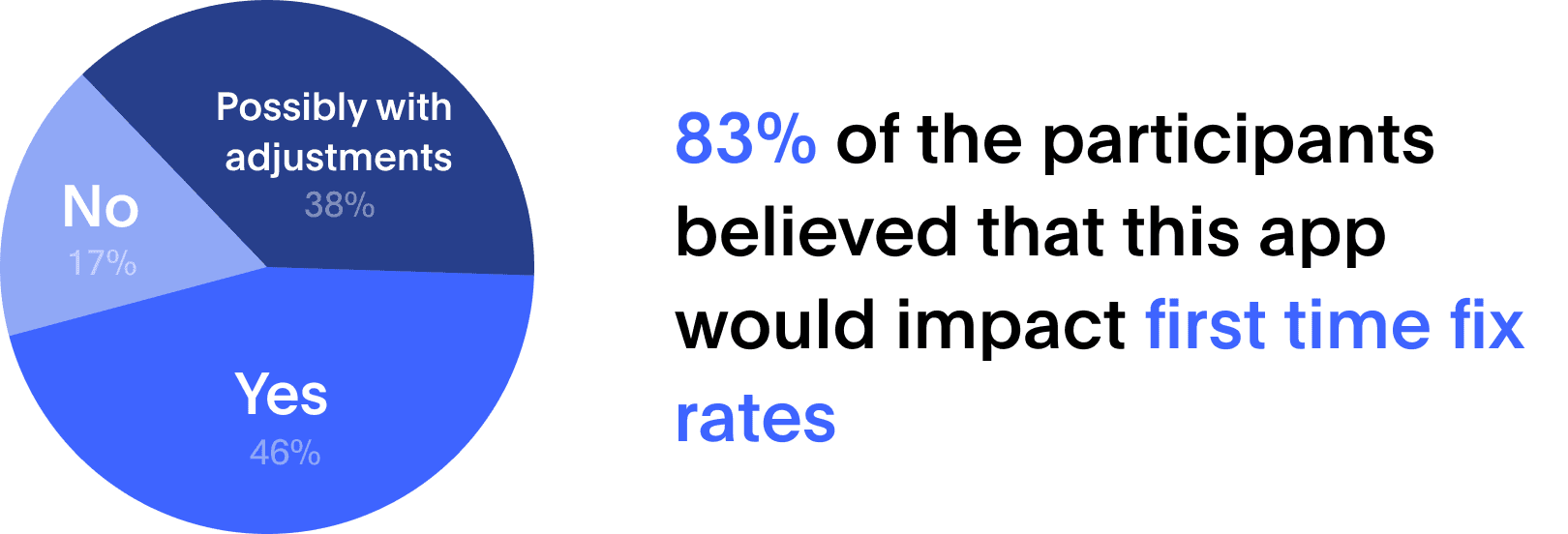
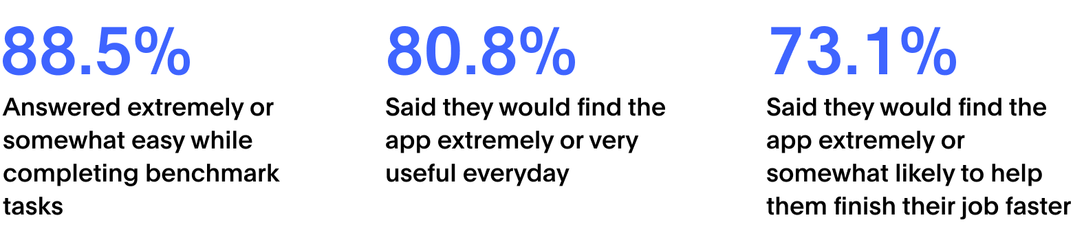
We gathered a mostly positive response to the prototype. Participants were able to perform the benchmark tasks with ease, and the survey allowed us to obtain qualitative data about user's thoughts while using the app. Here are a few highlights from the results:
Reflections
This was my first project since I began my Master's in HCI at Georgia Tech. It was a great learning experience working with my fellow classmates, all of whom come from varied backgrounds and complement each other's skill set. Being able to work with an industry partner definitely made the entire thing much more realistic than a traditional 'no-constraints' class project.
-
Real world immersion helps gain perspective about feasibility: When we initially started out, our stakeholders thought an AR solution would be the likely fix, but as we immersed ourselves in the user's shoes, we realized that due to various factors, an AR solution wouldn't be a practical choice. Since we had concrete research, this helped us convince stakeholders to let us pursue different directions apart from AR.
-
Designing for a diverse user group: While evaluating our designs throughout the project, we always pushed to get a varied sample for testing. This helped in making sure that our solution wasn't targeting just junior or senior service technicians individually, but could instead help improve repair times for Unified Brands as a whole organisation.
Next Steps
If we had more time, we would have loved to conduct in-depth ride along usability studies with various service technicians of differing experience levels and tested the prototype in the field/real world scenario. This would have helped us identify some of the feasbility factors such as greasy hands, usability of the interface in terms of accessibility, information architecture, and our solution's impact on helping improve first time fix rates.